Nonprofit
Logo design for Code for Boston
Code for Boston is a local meetup that uses creative uses of technology to address social and civic challenges in the Boston area.
I led the redesign of their logo and identity to bring a more modern, friendly interpertation of their historical roots.
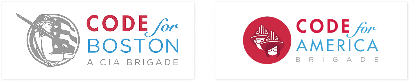
Honor the past in a new light
The team commissioned me to explore alternative logo treatments to retire the existing Minuteman logo. The goals for this redesign were to:
- Still lean into imagery of Boston's history, and the theme of dedicated volunteers coming together rapidly to solve local issues
- Lean into the group's values of optimism, inclusion, partnership, and hard work, and capture the welcoming, approachable, capable personality of the community
- Create a flexible treatment for various uses - web, presentations, apparel, print, and most immediately, stickers for an upcoming hackathon.
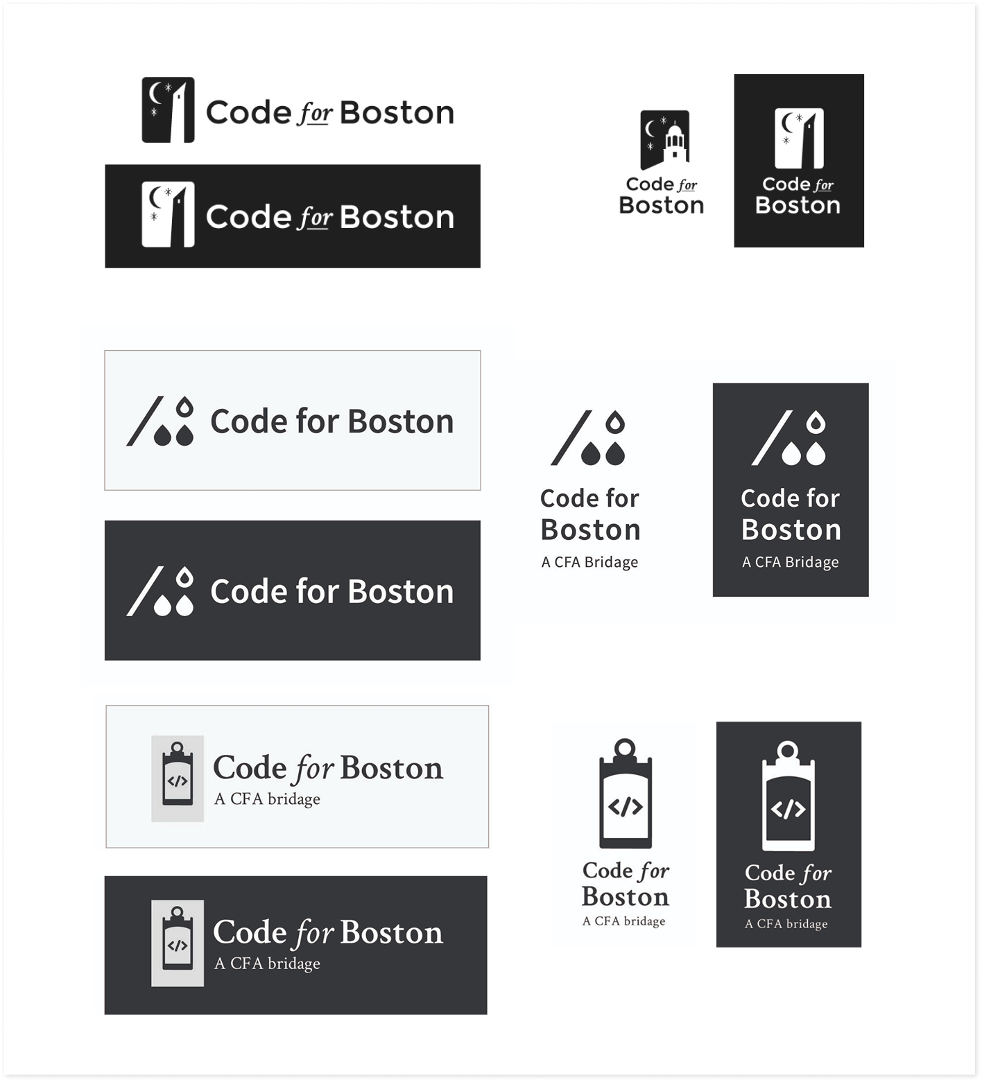
- Explore their own style. The initial logo leaned heavily on default Code for America styling, but after 6 years the team was open to exploring divergent options.
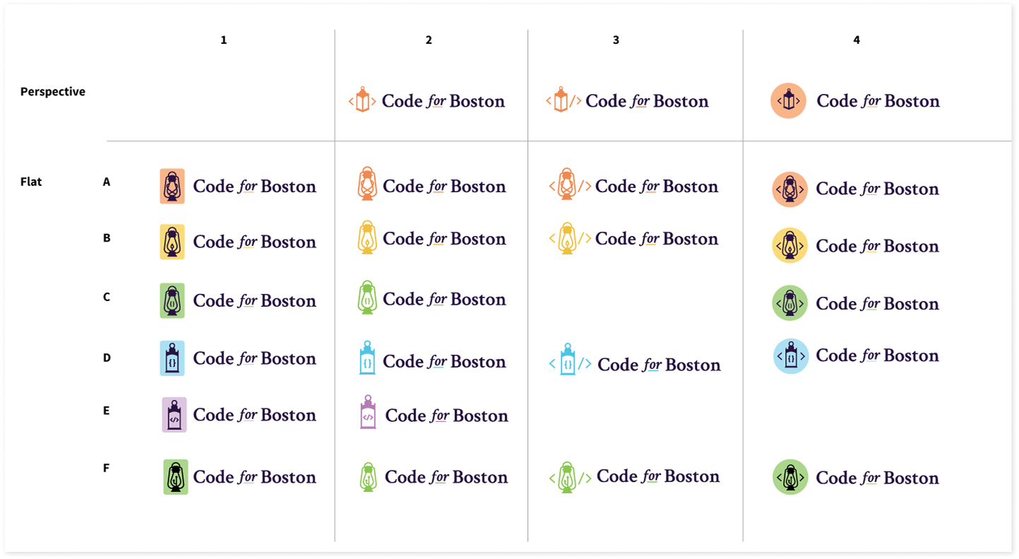
Designing a new logo mark collaboratively in less than three weeks
I focused on graphic elements first, since that was most pressing for their upcoming needs. I looked at the styling evolution for other brigades and Boston-based companies to get a sense of the landscape. Then, I began experimenting with imagery referencing Boston's history.
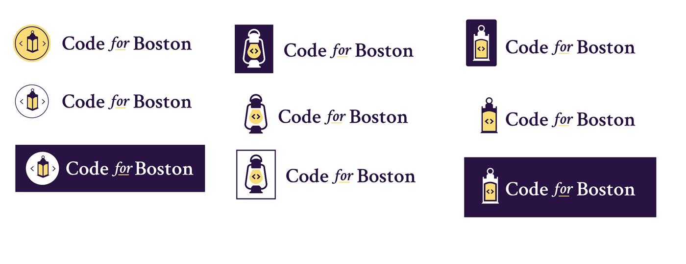
Quickly the lantern concept sparked a lot of interest from the team. The "beacon for action" theme aligned nicely with the team's mission. I began iterating further on lantern styles, exploring different lantern styles, perspectives, and color treatments.