Defining the visual language of startups
Cogo Labs is a startup accelerator that launches and accelerates B2C companies. Their mission centers on fostering the next generation of leaders at the forefront of consumer technology.
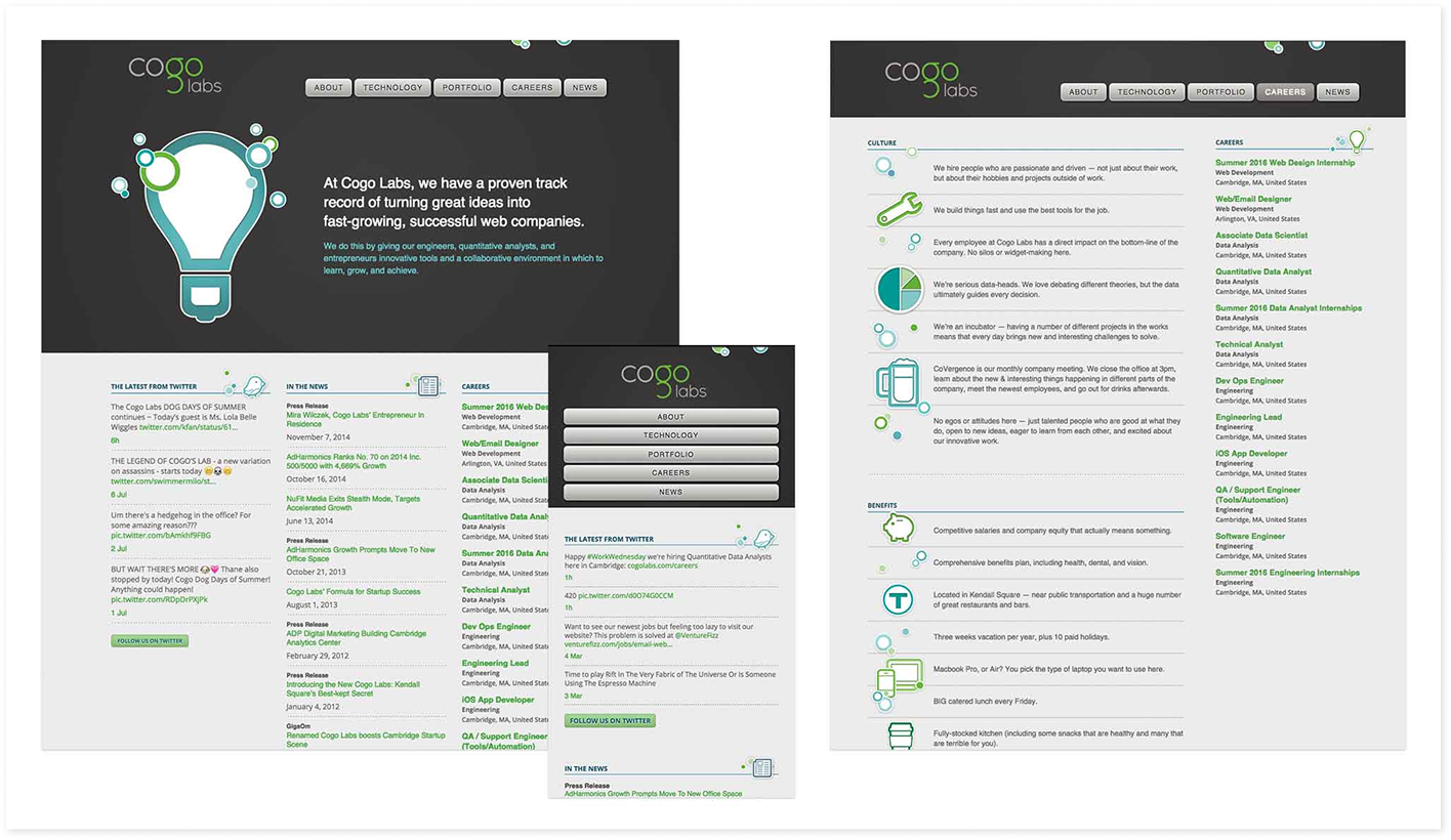
But the accelerator's flagship site reflected an older version of the company, and not the current focus on data science, autonomous teams, and rapid career growth. At the same time, the website was hard to maintain and update, and it was time to migrate to a modern, scalable architecture.
I led a full rebranding effort of their flagship website and aligned the company's digital presence to their current vision ahead of a rapid increase of hiring across the portfolio.
Outcomes:
- Launched a redesigned site and style guide that represented the current culture while improving performance and information hierarchy across devices.
- Potential applicants could clearly define the mission and team culture in post-launch testing.
Weaving together many design disciplines on a small team
The design team was still growing, and I was the principal designer for the effort. I owned visual design, content design, interaction design, and research, while also working closely with internal stakeholders on brand alignment and web engineers on implementation(#smallteam).
The first step was to align on the goals of the redesign. I audited the current content of the site, reviewed current web metrics, and met with a number of key people at Cogo to understand target markets. I also did a full design review of our current site and of other startup incubators and accelerators.
Focusing rebrand goals with the team
From this internal research, we defined a set of goals for the redesign:
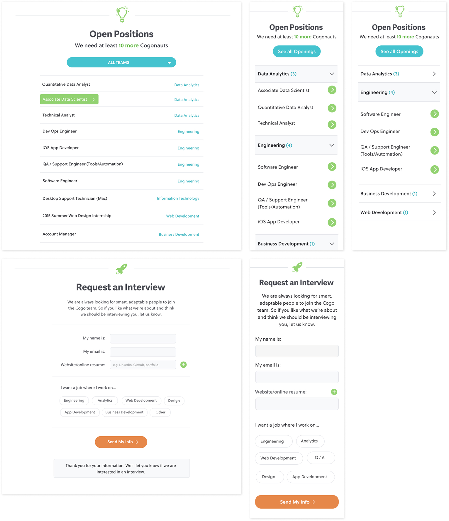
- Serve job seekers: Large scale hiring was on the horizon and metrics showed significant traffic to job pages, but we observed job seekers often were unsure how accelerators operated.
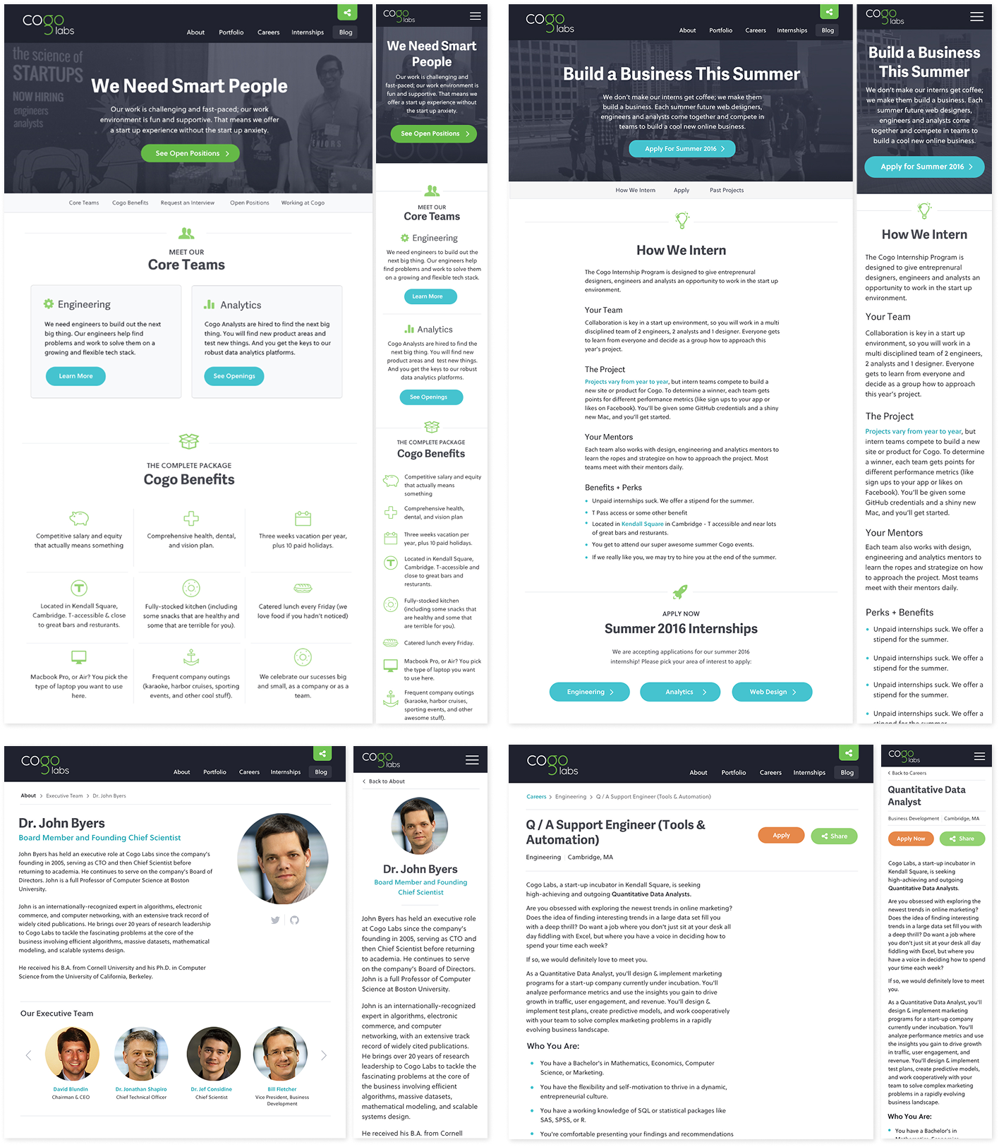
- Show off the culture: Accelerating the careers of employees was one of Cogo's key values, and it offers early career technologists a lot of freedom to explore and experiment. We wanted the site's style and content to put these values front and center.
- Strengthen design and content hierarchy: The old site had very limited typographic and design hierarchy, with overpowering graphics pulling attention away from key content. I wanted the new design to have a strong typographic and color system that gave structure to the page, in addition to a refreshing look and feel.
- Lean into responsive design: The old site used an ExpressionEngine template that had limited responsive styles, and exacerbated hierarchy and readability concerns on mobile devices. We wanted to create flexible templates that would have an impact on any device.
Supporting front-end implementation
Once we defined key visual elements, we moved on to development. The site was built using Express.js for a web framework, Keystone.js as our CMS, and Jade and Stylus on the front-end to create cohesive, clean styling.
I worked closely with our web engineers to build the CSS theming and define page layouts. I also implemented certain features on the site, like job filtering, to deepen my Javascript skills.
Building a usability practice
I successfully pitched leadership on a series of lightweight usability tests to validate that the site's design and message was landing with potential applicants. Our main objectives were to:
- Confirm applicants could navigate the site effectively to do key tasks (find jobs, view companies, schedule an interview)
- Verify that new language on the team's mission and types of work done was understood and appealing to applicants
- Build a usability practice for the team, and develop templates and processes we could reuse across the portfolio.
I recruited research participants, established a consent and interview protocol, and trained other team members on how to faciltate interviews and handle compensation. We found that, by in large, the redesign accomplished it's goal - the concept of an accelerator needed more definition, but potential applicants could more accurately describe what their work would look like if they worked here.
A successful launch that enabled team growth
We launched the site successfully, which was used to hire dozens of engineers, data scientists, and designers. Our scalable CSS and content management system integration made it easier for staff to maintain and extend the company's digital experience over time. The usability resources and processes I designed became a blueprint for other teams and companies.