Redesigning Mass.gov
Over 75% of Massachusetts residents interact with the state government through Mass.gov. Millions of Massachusetts residents use Mass.gov to access services from hundreds of departments, commissions, and offices - from everything from renewing a drivers license to starting a business to accessing emergency food assistance.
I led design and research initiatives for the highly collaborative, fast-paced team to make digital touchpoints with the state government more responsive, accessible, and user-centered for 6.5 million Massachusetts residents.
Outcomes:
- Launched a redesigned Mass.gov that transformed over 250,000 pages of legacy content into a service-centered constituent experience optimized for responsiveness, plain language, and accessibility.
- Migrated thousands of documents from PDFs to accessible, responsive HTML templates.
- Designed faceted search interface for government services that ultimately became the blueprint for current Mass.gov search.
- Scaled user research practice within the digital team and across agencies through coaching and collaborative research practices.
Designing a modern, accessible digital policy hub
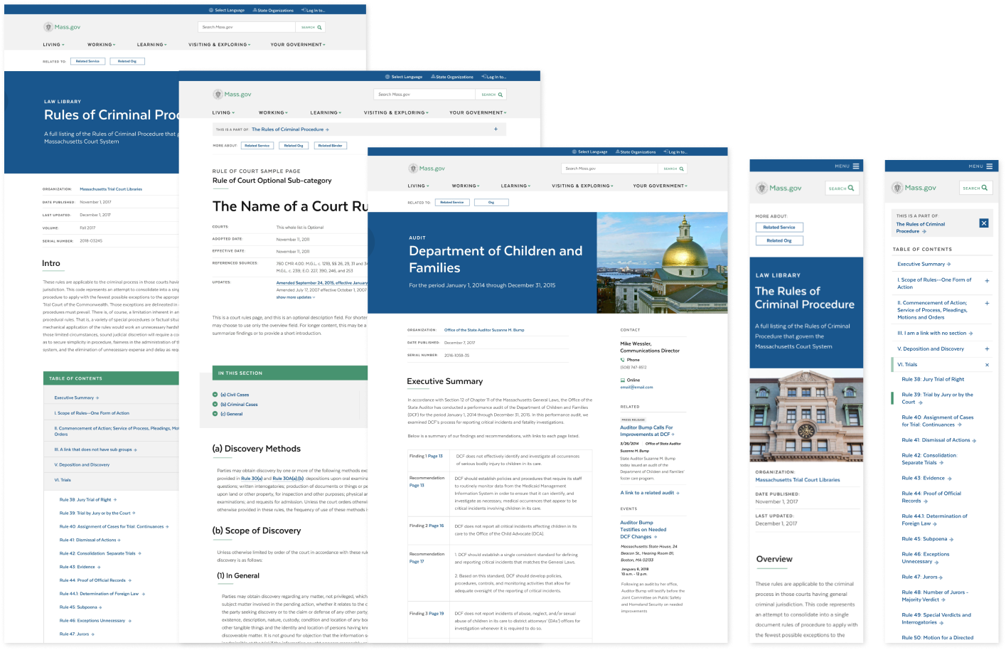
In addition to transactional services, Mass.gov is the home for volumes of agency reports, regulations, and policies. This information is often essential for the public, the business community, and state and local workers.
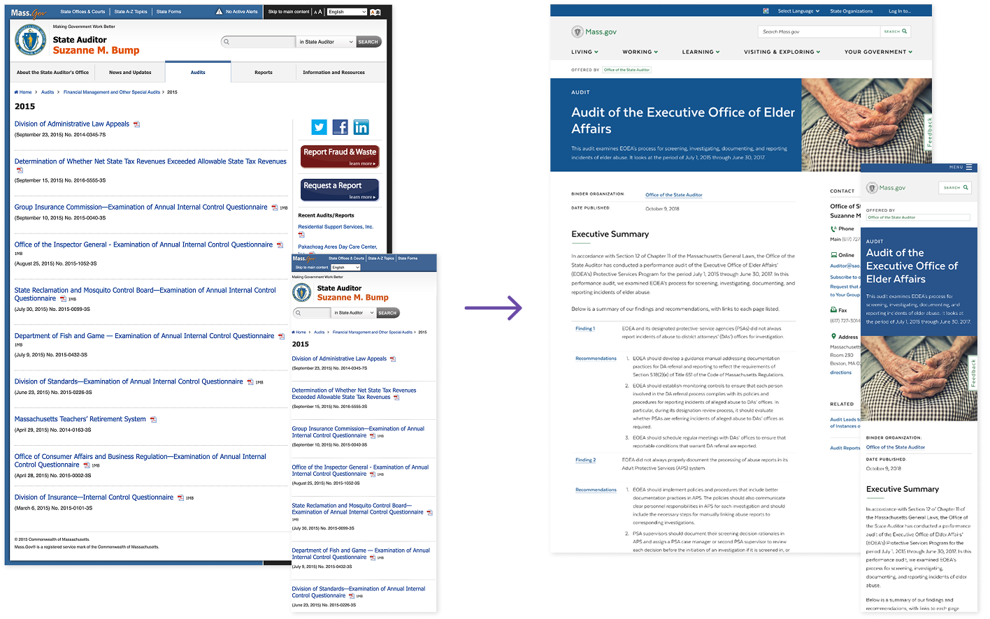
On the legacy site, regulations, policies and reports were often published as a PDF or Word doc, which made it hard to find via search and less accessible than content published as HTML pages.
I led an end-to-end design of a flexible, responsive template that enabled agency partners to easily post policies, reports, and coversheets as HTML, making them more searchable and accessible.
Collaborative design with agency authors and close pairing with developers
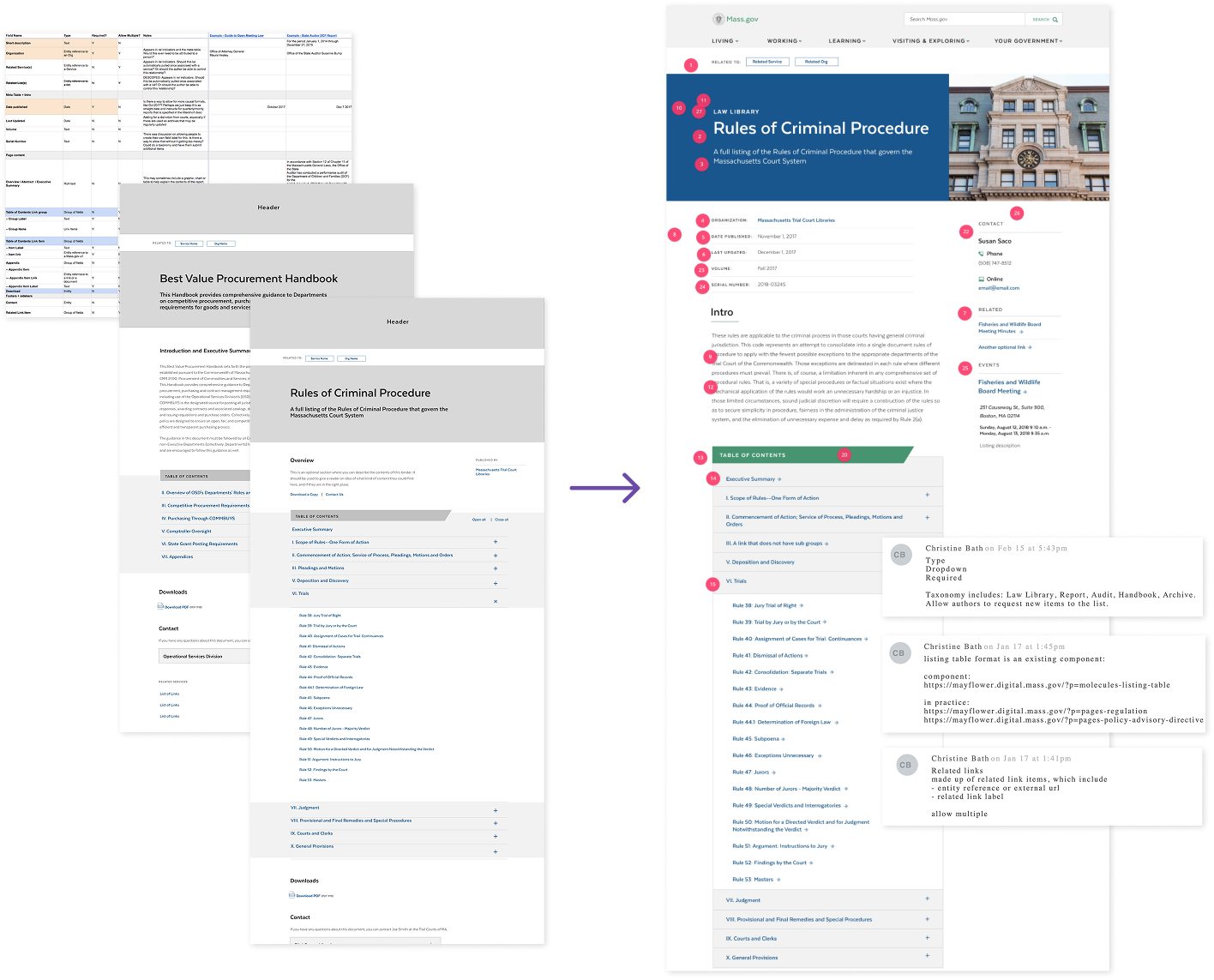
I led research sessions with agency staff who manage this content and with people who regularly access this information. We needed a solution that would be flexible for many types of content, so I audited multiple information collections to develop a draft data schema and wireframes.
I used the draft data schema to create wireframes that I reviewed with authors, site visitors, and team members including product owners, content strategists, and engineers. After iterating with stakeholders, I created high fidelity designs based on the Mayflower Design System.
Fewer PDFs, more accessible HTML, and an accelerated site migration
We successfully launched these templates, which created a low effort pathway to migrate top information collections to the redesigned Mass.gov. Thousands of policy documents, regulations, and reports now live in HTML, making them more searchable, accessible, and responsive.
I wrote initial annotations based on research and then reviewed them in detail with our engineering team, and collaboratively updated the designs based on their feedback. This feature is now live and well used on Mass.gov.
Designing a faceted search for government
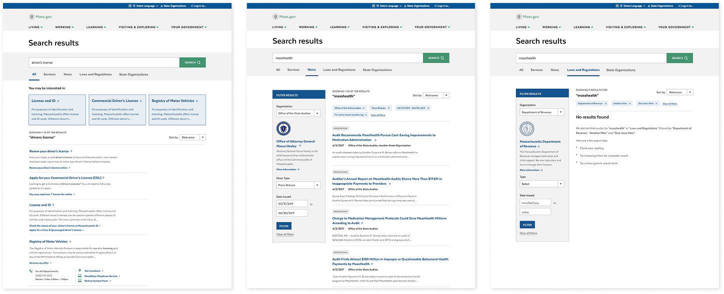
Analytics showed that search was an essential tool used to find information from government agencies. We wanted search to work with the redesigned, ntuitive navigation to quickly get constituents to the content they needed, regardless of device.
Search engines and high traffic ecommerce sites use faceted search to allow visitors to narrow huge volumes of results. On Mass.gov we had a similar challenge, but a very different information architecture. I led the initial design and testing of a faceted search interface for government content.
Creating prototypes to test team assumptions
I worked with the product owner, engineers, and content strategists to create high-fidelity prototypes to test different approaches to a faceted government search. We had hypotheses for what top-level filtering categories may be, and that a toggle to exclude more technical content would be useful.
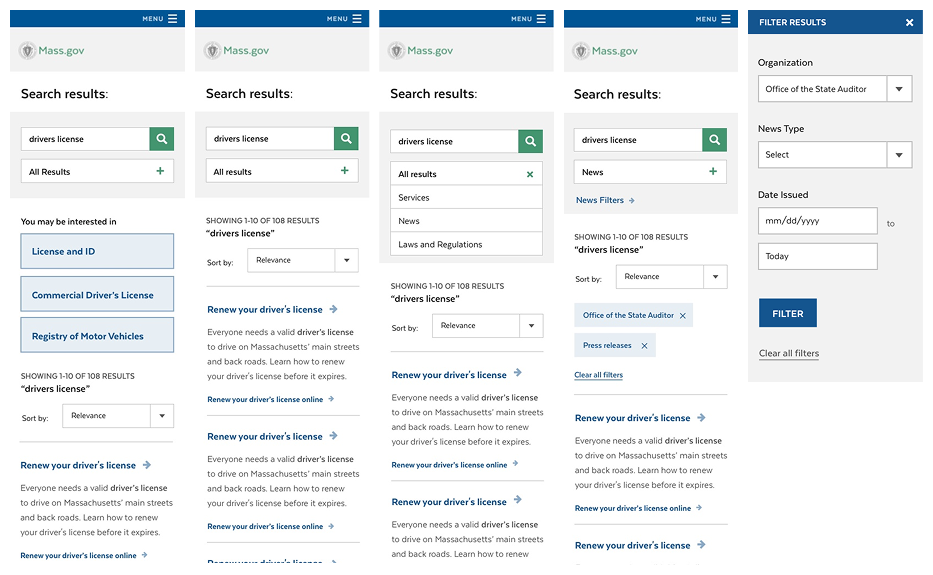
I led multiple usability tests with departmental stakeholders (who we suspected would be heavy users of these features) and members of the public. To ensure we tested the full interaction, I built clickable prototypes to test the full flow and designed an interview protocol to explore many kinds of search.
We found that while our broad categories were solid, the toggle filter caused more confusion than clarity. In the final design, we chose to remove it.
Removing clicks with rich search results
To make search even more powerful, I evaluated the structured data behind page templates to propose a series of rich search previews depending on the type of content surfaced. I worked with Drupal engineers and front-end developers to understand what was feasible, and worked within design system patterns to propose a series of rich, responsive search result previews.
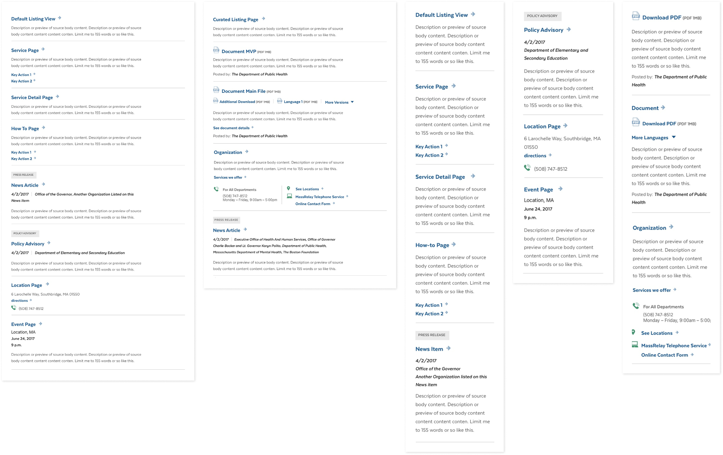
Ultimately this validated our search design strategy. Future teams used this work as a blueprint to launch the faceted search now available today on Mass.gov.
Creating adaptable navigation components for departmental pages
During research on high frequency Mass.gov visitors, we learned that agency organization pages were hard to navigate, and certain audiences relied on these pages as a waypoint for services and information.
The organization page template had been highly reactive to customer requests, and had evolved to create long, dense pages. New template subtypes also created confusion for agency authors.
I led a design sprint to quickly iterate on the template and improve its navigation. The goal was to:
- Identify missing navigation markers on organization pages and inconsistencies between template subtypes.
- Create pathways to information lower down on the page, like office locations, application log ins, and key services.
- Keep the one-page model (for now); avoid organizational sites or top-level navigation changes.
- Test any new patterns with real users
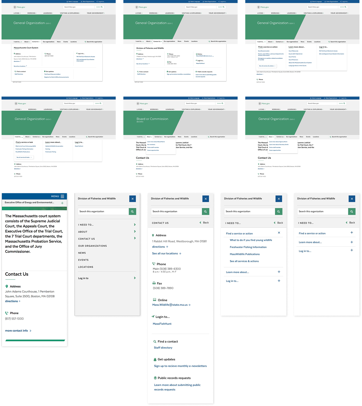
Deploying a flexible component that extends design system guidance while offering thoughtful flexibility
First, I evaluated the original design specs to what agency authors had actually implemented, and requests for additional functionality. I also audited the existing data model and UI to identify what information and features were consistent across different template variations, and where there were opportunities for alignment.
There are hundreds of organizations on Mass.gov, and I wanted to optimize for predictable experiences that followed design system guidance, while also offering flexibility for departments to adapt their navigation to their audiences.
I reviewed these findings with the team and then began designing and testing different sub navigation concepts. We landed on an optional sub navigation component that agency authors could adjust within set categories. I tested the navigation with TreeJack and in usability tests, and post-launch ran Chalkmark heatmap tests which confirmed the new navigation was used and findable.
Scaling user research practices to improve digital touchpoints
The redesign offered an opportunity to rethink digital experiences beyond Mass.gov, and scale research operations for the Commonwealth. I led many research initiatives during my time with the team,
Research initiatives I supported included:
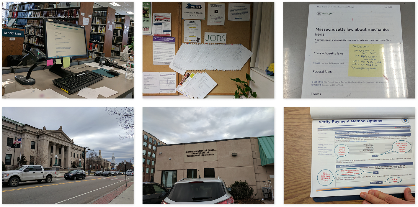
- Running intercept testing at RMVs to evaluate Real ID messaging and prototypes.
- Organizing sessions with law librarians to observe Mass.gov's on-the-ground role in delivering legal resources to the public.
- Growing a user testing panel to recruit members of the public for voluntary usability testing.
- Recruiting and conducting interviews with high-frequency Mass.gov audiences, including trade and professional organizations, state and municipal workers, and local businesses.
- Interviewing job seekers and collaboratively mapping the key points in their journey to getting unemployment benefits.
- Designing and facilitating research sessions with DTA benefit seekers to identify which visual indicators and affordances they rely on to determine a site is a trusted government source.
- Mapping the license suspension hearing processes to scope future tech and service improvements.
- Creating a usability benchmarking testing cadence to assess template performance post-launch.